Frontpage
Visual Complains
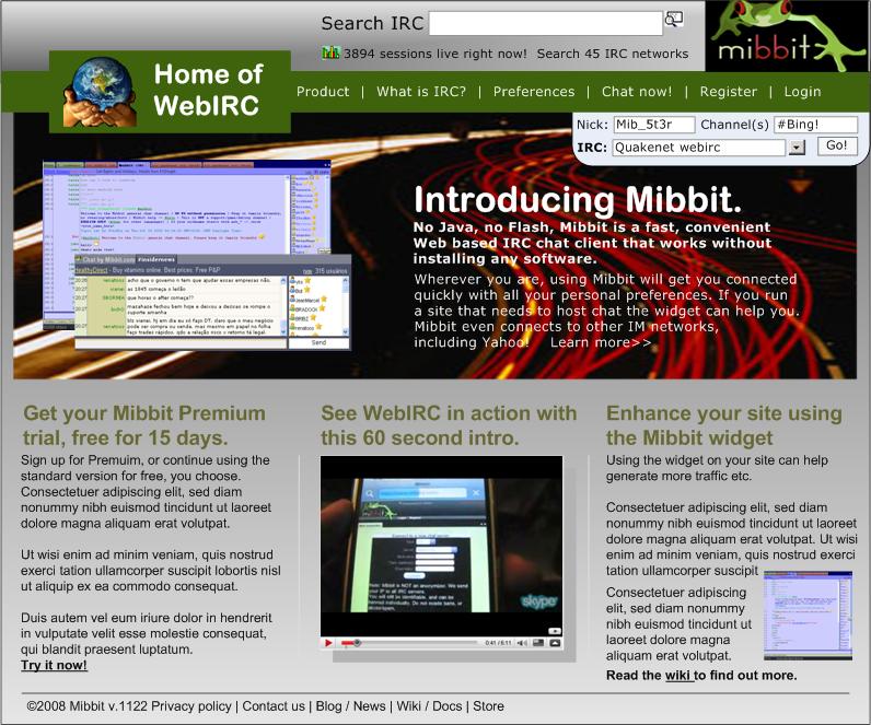
- The background in the middle is not needed. It would look more simple, and more readable.
- The image next to "Home of Web IRC" does not fit the client.
- The graph image makes it look awkward next to how many live sessions there are.
- Need of a visual divider between version and Private Policy
- "No Flash" is a lie with the current way sounds are supported.

